

Showing posts with label Brand/Logo. Show all posts
Showing posts with label Brand/Logo. Show all posts
Feb 7, 2023
Bohoy Designwork

Dec 17, 2018
Wishing you...

Johanna designed this holiday logo to represent all that we wish for friends, relatives, and clients– now and into 2019.
Nov 12, 2018
PEM Case Statement & collateral

For this expansion PEM hired Bohoy Design to create a case statement to help raise the $125 million needed.
The final result was a portfolio of colorful, interrelated pieces that represented the vision of the director and what the “new” museum would be.
To market the new museum and also it’s unique Chinese House [YYT], which was brought over from China and reassembled on their newly transformed museum campus, two informational brochures were produced by Bohoy Design.
Feb 14, 2017
Fundraiser for families

Bohoy Design produced this logo using, by their request, their historic 1885 settlement house Ellis Memorial that houses their programs, people and care.
Mar 11, 2016
Branded Blog Banner
A woman's new blog about beauty needed a "makeup" job before appearing in public. Bohoy Design created this logo/header that incorporated an illustration that melded with the title and explained the name.


Mar 11, 2015
Boston Chowda

Our whimsical illustration did just that.
Sep 26, 2013
The Meatball Shoppe


Mar 7, 2013
Anniversary Campaign design


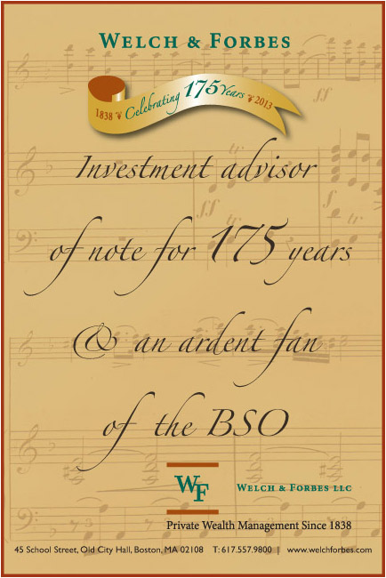
Welch & Forbes, financial advisors are still cruisin' since 1838.
Celebrating their 175th anniversary this year, BOHOY DESIGN was commissioned to design an anniversary seal, a banner, ads and booklet to commemorate the occasion.
The above full page ad just ran in the Boston Business Journal, and this musical note ad is one of a series running in the current BSO programs.
May 31, 2012
Meetings

We've had many.
Some productive; some not.
Some fun-filled; some not.
Cups are de rigueur along with pen and paper and here are some that sport logos we have designed for various clients. [plus a hat and pad].
Meeting's adjourned.
Sep 13, 2011
Rise up
 Chef Yves B. is the soufflé expert.
 He's been whipping them up in copper bowls since he was 14 on l'ile de Re on the coast of France. Now a world class chef, he decided to share his expertise and package up his wonderful no fail soufflés for the masses.
Bohoy Design created his "mischievous" logo and designed the packages for 5 flavors- from sweet to savory. His soufflés rise and Bohoy Design rose to the occasion.
A perfect recipe.

Oct 25, 2010
On the move...
 The company Women on the Move "takes the trauma out of moving" by customizing a move, from packing and unpacking to selecting a reliable moving company.
Bohoy Design designed their logo/ID that was then placed on the most important tool of their business-- moving boxes.
That helped put them on the move.
Jun 30, 2010
Unveiling
 The Beverly Farms Library was marrying their 1910 building with a new addition. To celebrate the accomplishment, the fundraising committee held a mock wedding celebration and reception for the community. Bohoy Design produced the invitations, promotional material, and this logo that utilized intertwined rings to symbolize the marriage of the old & the new.
Mar 17, 2010
Reaching for Stars
Oncology Rehab Partners is an innovative healthcare company
breaking new ground in the field of cancer care.
BOHOY DESIGN developed a logo, and web banner identity for
their STAR (Survivorship Training and Rehab) products, developed
by Julie Silver, M.D., that provide facilities and clinicians with
tools and programs to deliver oncology rehabilitation care.


breaking new ground in the field of cancer care.
BOHOY DESIGN developed a logo, and web banner identity for
their STAR (Survivorship Training and Rehab) products, developed
by Julie Silver, M.D., that provide facilities and clinicians with
tools and programs to deliver oncology rehabilitation care.


Jul 28, 2009
Take it Home

 Bohoy Design's client fell in love with the cassava treats that they ate while on a trip to the Caribbean and brought them home to produce in the US. They needed an identity and package to reflect where they came from so Bohoy Design created a logo and box that conjures up the tropical experience of balmy nights and sunny days, turquoise waters, rain forest flowers... and Joy!
Jun 29, 2009
Lots of Logos

 Bohoy Design has been called upon to create identities for numerous companies–
from food to tech–
big and small–
established and start-ups.
Apr 21, 2009
Shelter from the storms

Salem Missions works to offer men and women the opportunities they need to end their homelessness.
Bohoy Design designed this pro bono logo for one of their Spring fundraising events "Spring for Hope" with the hope of helping the mission's goal.
Nov 24, 2008
'Cran' Brand


New England Cranberry Co. wanted an updated image- away from 'ye old country store look' to a contemporary, clean, simple brand presentation that visually stated that "Cranberries aren't just for Thanksgiving."
Bohoy Design created a fresh new look starting with the logo and sage green labels, followed by the brand extension to other products: chocolates, syrup, gift box, etc.
Some of the family of products shown.
Oct 3, 2007
Bites
 A new product.
A new brand.
Cape Cod Bay Company wanted a clean New England look that visually represented their name for their new brand ID/packaging.
Bohoy Design gave them a nautical banner with blue sea and sky, seagulls, and the obiquitous Cape Cod lighthouse as a backdrop for their calamari bites.
Jun 7, 2007
Eye opener
 This logo was developed by Bohoy Design for a new coffee café on the Gulf coast of Florida. Since they are located on the waterfront, the coffee cup holds a combination image of the morning star, sunrise, and sunset that greets them each day.
Subscribe to:
Posts (Atom)


